Freelance Jobs

Monday, May 14, 2012

Full flash banner tutorial + link to a website for Action Script 3

Full Flash tutorial


Flash swf file

Step 1
Create a new flash document, choose Modify - Document , and set Width to 430, and Height to 180px. Frame rate set to 22fps. (Frames per Second)


Step 2
Choose pictures and set their dimensions as background (430x180px), using Adobe Photoshop. (Ctrl+Alt+I)


Step 3
Double click on layer1 to rename its name in picture1.

 
Step 4
Choose File - Import - Import to Stage (Ctrl+R), and Import the first picture. Center the picture so it can fit to the border. Using free Transform tool (Q) you can scale the picture.


Step 5
Click on frame 80 of layer picture and press F5.


Step 6
Insert a new layer and name it line1. Select it, take the Rectangle Tool (R), Stroke color must be switched off, under Fill color choose white color and draw a small "rectangle" 10x20px. Set the picture in the middle.


Step 7
Click on frame 10 and press F6. Then, take the Free Transform Tool (Q), and stretch the rectangle till the end of the picture, the way it's shown below.


Step 8
Click on frame 20 and press F6. Take the Free Transform Tool (Q) and stretch the rectangle to the peak and to the bottom.


Step 9
Go back on frame1 and and after that on frame 10. Open Properties Panel (Ctrl+F3) and under Tweet choose Shape for each of those frames. (frame 1 and frame 10).


Step 10
Select line1 layer and convert it to a mask by right-clicking on the line1 layer and select Mask.


Step 11
Select the line1 layer, insert a new layer and name it picture2

Step 12
Click on frame 60 and press F6. Press Ctrl+R (Import to Stage) and import another picture.

Step 13
Click on frame 160 of layer picture2 and press F5.
 
Step 14
Insert a new layer and name it line2. Repeat steps 6-10, but for this time the animation "rectangle" will start from top left side like this picture below.

Step 15
Try now the same with picture3 so you can easily learn and practice in this way.

 
Step16  -  Linking the banner with a website
Insert a new Layer and name it Actions. Click on Frame1 and draw a rectangle that can cover all the square. Go to Modify - convert to symbol - click on Button and press ok. Double click on rectangle button and the button menu will appear. Press F6 for all 4 frames "UP, Over, Down, Hit". Then click on Scene 1 and you will come back to your layers.


Step 17
Bring your layer Actions below all layers and select frame1.


Now click F9 to open ActionScript and an Action Script menu will appear.

Write the following code:

addEventListener(MouseEvent.CLICK, onClick);
function onClick(e:MouseEvent):void{
navigateToURL(new URLRequest("http://www.photoblogarea.blogspot.com/"), "_blank");
}

In the URL request you can put your website!


If you have any questions send me an email and i will try to answer you.


Sunday, January 15, 2012

How to make a nice background for products in a brochure in Photoshop ?


If you think that those articles are useful please support me by clicking on the sidebars.


Firstable we have to choose a material that it's close to the theme of our brochure. I was actually doing a themed brochure about some products from Africa. So i choose picture of banana leaf with very contrast color and the image is really punching. My whole brochure was in different style of colors so it would look different if i just paste the image to my brochure.


So i add a new layer and paint with the bucket with colors: C: 56 M: 28 Y:100 K:8


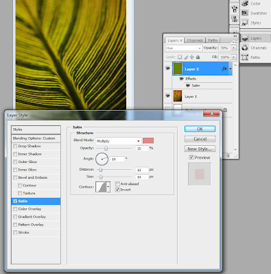
Make the layer with 70% opacity and add an effect on it in layer style: Satin > blend mode: Multiply, pink color, Opacity: 25%.


After we add one more effect on it to become more realistic pad to look like it's handmade. We go to Filter> Artistic > Texturizer: Scaling:100 Size: 4


So in the as a result you need to achieve this:

Saturday, April 17, 2010

How to shoot chrome objects ?


 If you think that those articles are useful please support me by clicking on the sidebars.


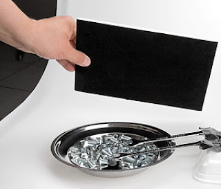
From the photographic point of view bright objects have a specific characteristic. In order, to achieve good results we should take more attention to the environment in which we work. Otherwise, you will be worried all the time abouth bright correction of the image and the contrast.


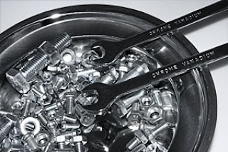
Let's do an experiment as we dedicate a composition of chrome objects with built-in flash of the camera. As you can see on the picture above, the result is disastrous. The reason for this is the large range of brightness between the flash, which is reflected in some areas and dark parts of the image. We can avoid this effect  surrounding the whole composition with an equal illumination. Most can easily provide it with a tent for product photography.


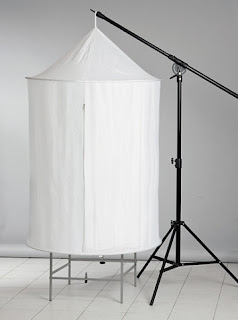
Tent is made of white coated fabric that dissipates light passing through it. Diffusion effects are amplified by multiple reflections of light in the inner walls of the structure.
Tent is big enough to fit inside your table for product photography. You can open it along its entire length by a double zipper. This allows to work freely, while arrange objects inside, and when we are ready to shoot you can close it  leaving only a small gap through which to pierce the camera lens. The whole structure is held on two elastic ring and could be folded like the 5 in 1 reflector, thereby occupies less space in the entire structure is supported by two elastic ring and allowing it to be folded, thereby occupies less space for storage.
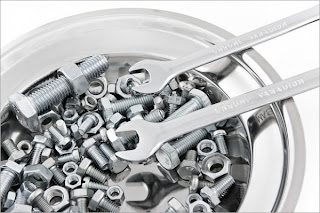
In the picture below you can see the same composition as the beginning of the article. As regards the technique of shooting the main difference is that the table is subject postavena in palatka cone-cylinder. Tent was lit by two mono Dynaphos B-600 with standard 14cm reflector.


Image is predominantly light tone,   this reflection come from the white walls of the tent. Some of the lines of the objects are not very legible. In this case, we can emphasize the shapes of objects by adding some black surface in the vicinity. The effect of repercussions depends on the size of the black surface that you use. Interesting effects can be obtained by using color instead of black surface.


Източник на урока: http://dynaphos.com

Sunday, April 11, 2010

South Park


 If you think that those articles are useful please support me by clicking on the sidebars.


Южен парк


How to make lomo effect on the image ?


If you think that those articles are useful please support me by clicking on the sidebars.


In this lesson you will learn how we can achieve a Lomo effect on a picture:


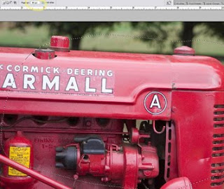
Open the photo. The first thing you should do is to take the freehand lasso tool and make a circle around the picture. It's not necessary to be perfect, remember to prevent hard edges, I put pen to 80-90px.


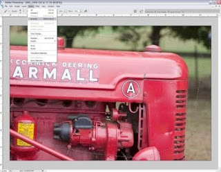
Once you've put pen (shown above) and draw a circle, you must invert the selection. You can do this in two ways. Ctrl + Shift + I or go to menu Select > Inverse.


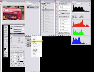
Now to achieve the vignette, I add Levels layer.
Note: I still have invert selected.
Setting must be the following:


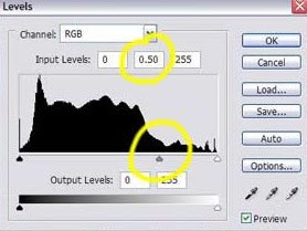
This will add masked layer on top of your original layer. Then i put up levels by moving the center arrow to the right. This will darken the edges, giving me VIGNETTE. The amount is up to you and in this case I went from 1. 00 to 0. 50 central figure highlighted in the image below.

Sunday, April 4, 2010

How to make an image look old ?


If you think that those articles are useful please support me by clicking on the sidebars.


Now we will make photos look very old:
 

1. Open your desired image:
 photoshop tutorial
and most importantly, open your file texture you will use. I choose wrinkled brown paper:

2. Duplicate the main image and open the settings window Level menu Image -> Adjustment -> Level. I used the following values​​:  52, 1, 44, 255.

3. Now apply a sepia effect, go to Color Balance (Ctrl + B). I set these values ​​to achieve a sepia effect: 64, -4, -73.

4. Again, go to Level window of Image -> Adjustment -> Level. This time, put the following values​​: 34, 0.89, 255.

5. Copy the image of the paper and put a layer over your photo. Change the blending mode to Overlay.

6. Use the tools Dodge Tool and Burn Tool, to make your picture look really very old.

7. Go to menu Filter -> Noise -> Add noise and add a little noise of photography.

Here are the results:
photoshop tutorial

Източник на урока: www.dphotojournal.com