If you think that those articles are useful please support me by clicking on the sidebars.

Firstable we have to choose a material that it's close to the theme of our brochure. I was actually doing a themed brochure about some products from Africa. So i choose picture of banana leaf with very contrast color and the image is really punching. My whole brochure was in different style of colors so it would look different if i just paste the image to my brochure.

So i add a new layer and paint with the bucket with colors: C: 56 M: 28 Y:100 K:8

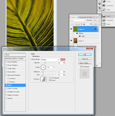
Make the layer with 70% opacity and add an effect on it in layer style: Satin > blend mode: Multiply, pink color, Opacity: 25%.

After we add one more effect on it to become more realistic pad to look like it's handmade. We go to Filter> Artistic > Texturizer: Scaling:100 Size: 4

So in the as a result you need to achieve this:
